COHESION · DESIGN SYSTEM
One system for every page
The shared foundations, components and section patterns behind the Cohesion template. Every value here is a live style or component: change it once and the whole site follows.
Color
Typography
Spacing & Radius
Components
Section Patterns
Color
Semantic color styles grouped by role. Use Text styles for copy and icons, Surface styles for backgrounds, Accent for calls to action and links, Status for confirmations.
Text
Text/Primary
rgb(0, 0, 0) · Headings, primary copy
Text/Secondary
rgb(77, 77, 77) · Body copy
Text/Tertiary
rgb(128, 128, 128) · Meta, captions, nav
Text/Subtle
rgb(153, 153, 153) · Card meta
Text/Disabled
rgb(179, 179, 179) · Disabled states
Text/Inverse
rgb(255, 255, 255) · Text on dark or accent
Surface
Surface/Default
rgb(255, 255, 255) · Cards, sections
Surface/Page
rgb(250, 250, 250) · Page and footer background
Surface/Subtle
rgb(242, 242, 242) · Quiet fills, numerals
Surface/Inverse
rgb(26, 26, 26) · Dark buttons and badges
Surface/Glass
rgba(255, 255, 255, 0.5) · Frosted overlays
Accent
Accent/Primary
rgb(102, 112, 255) · Links, highlights
Accent/Primary Soft
rgba(102, 112, 255, 0.1) · Button rings
Accent/Primary Faint
rgba(102, 112, 255, 0.05) · Card rings
Accent/Secondary
rgb(249, 71, 6) · Prices, primary CTA
Status
Status/Success
rgb(0, 204, 153) · Check icons
Status/Success Soft
rgb(102, 255, 217) · Check backgrounds
Typography
Public Sans throughout. Styles scale at three breakpoints: Desktop ≥ 1200 · Tablet 810–1199 · Phone < 810. Sizes below read Desktop / Tablet / Phone.
Heading 1
700 · 48 / 38 / 32px · 1.2em
The work speaks first
Heading 2
500 · 38 / 32 / 28px · 1.2em
Section headings
Heading 3
500 · 28 / 24 / 20px · 1.2em
Card and service titles
Heading 4
500 · 24 / 22 / 20px · 1.2em
Sub-headings and plan names
Body Large
400 · 24 / 24 / 16px · 1.2em
Lead paragraphs and introductions.
Body
400 · 20 / 18 / 16px · 1.2em
Default reading text for cards, quotes and pages.
Body Small
400 · 16 / 16 / 14px · 1.2em
Supporting copy, list items and captions.
Label
500 · 14px · 1.4em
Meta, tags and small UI labels
Nav Link
— · 18 / 18 / 16px · 2em
About Stack Services Projects
Button Label
700 · 24px · 1.4em
Let’s Work Together
Footer Heading
700 · 24px · 1.2em
Useful Links
Display Number
800 · 200px · 1.2em
01
Spacing, radius & elevation
A 4-point scale. 24 is the default gap inside cards and grids, 96 separates blocks inside a section, 192 pads sections top and bottom.
Spacing
4
8
12
16
24
32
48
64
96
192
Radius
6 · Chips
10 · Icons
16 · Swatches
24 · Cards
48 · Large cards
96 · Pills
Elevation
Soft · buttons, cards
Raised · cursors, photo
Layout
Content width
1152 px
Page gutter
24 px
Section padding
192 px
Block gap
96 px
Card / grid gap
24 px
Breakpoints
1200 · 810 · 390
Components & states
Reusable building blocks with named properties. Hover and pressed states are built in as gesture variants, so preview the page to try them.
Interactive
Button
Default
Primary action. Properties: Label, Icon, Link, Label Color, Background, Icon Color, Icon Background.
Button · Project CTA
Variant
Full-width call to action on project and legal pages. Background set per instance.
Button · Back
Variant
Used by Top Nav on detail pages. Label comes from Back Label.
Nav Link
Default · Selected
Top Nav and footer links. Selected marks the current section.
Tap Button
Default
Secondary control for in-component actions such as Show All.
Section Heading · Center
Center
My Stack
Every section title on Home. Property: Title.
Section Heading · Left
Left
Other Projects
Left-aligned variant for detail pages and this guide.
Check Line
Desktop · Mobile
Basic SEO optimization
Feature rows inside Pricing Card. Desktop and Mobile variants.
Cards & content
Pricing Card
Properties grouped as Plan (name, description, price, link), Features 1–9, and colors.
About Card
Rich-text card used in the sticky About sequence.
Skills Ticker
Code
Code component. Edit the Skills list, delay and colors in the properties panel.
Navigation & layout
Section Menu
Code component inside Top Nav. Edit the Items list (Label + Section ID = the section anchor’s ID, no #). It highlights the section in view and hides items whose section isn’t on the page. Direction: Horizontal on desktop, Vertical in the mobile drawer. The canvas shows the first item as active.
Top Nav
Fixed in the Main template. 5 variants: Desktop, Mobile Closed, Mobile Open, Back, Back Mobile. Links come from the Section Menu inside it; each page picks its variants through Main’s Nav Desktop and Nav Mobile settings.
Footer
Shared in the Main template’s Footer Section. Properties are the custom cursors shown on each link.
Content blocks
Service Title
Desktop-01
01
Website Design & Development
Numbered service row. Properties: Title, Number. Numeral uses Display Number.
Stack Card
" width="26.666666666666668px"><path d="M 0 40 L 0 0 L 26.667 0 L 26.667 40 Z" fill="transparent" height="40px" id="r5LVcnj8p" width="26.666666666666668px"/><path d="M 13.333 26.667 L 13.333 40 L 0 26.667 L 0 13.333 L 13.333 13.333 L 0 0 L 26.667 0 L 26.667 13.333 L 13.333 13.333 L 26.667 26.667 Z" fill="rgb(0, 0, 0)" height="40px" id="XCBSpwtXP" width="26.666666666666668px"/></g></svg>)
Tool card in the Stack section. Properties: Title, Content, Logo, Link, Rotation.
CMS Card
Desktop

Project card bound to the Projects collection inside Projects Collection Stack.
Project Photo Card
Image
Image card used three-up at the top of project pages.
Testimonial Card
Default

Sarah Jones
Marketing Manager, Green Earth Solar
“Larry’s design transformed our website! It’s not just gorgeous, but incredibly user-friendly too.”
Single quote with photo, name and role. Used inside Testimonials Slider.
Testimonials Slider
Default


Slideshow of Testimonial Cards on Home.
Faq Card
Closed · Open
Accordion item for the FAQ section. Settings: Question, Answer (rich text). Tap toggles Closed ↔ Open; use Closed Mobile / Open Mobile on Phone.
Collections
Projects Collection Stack


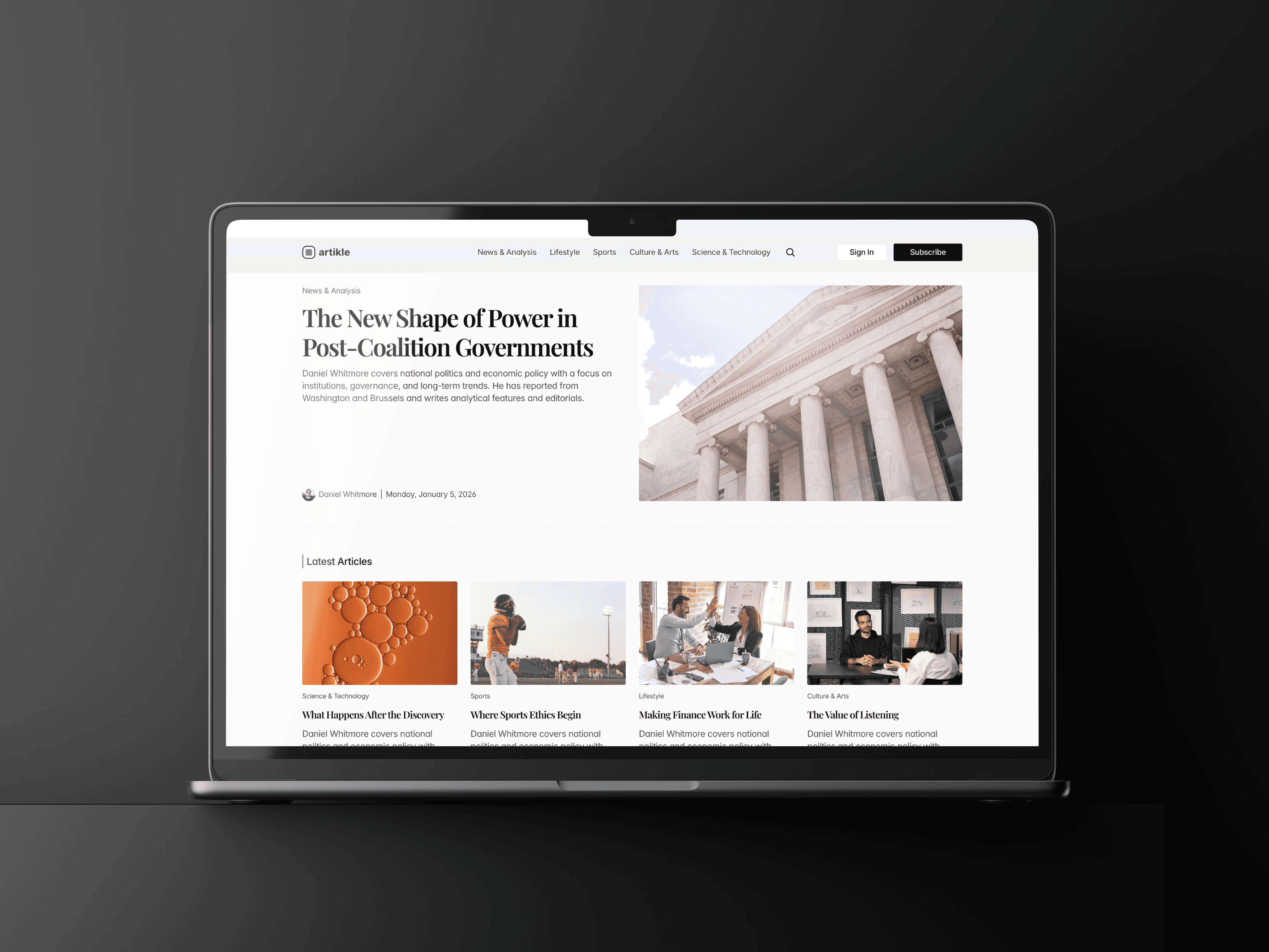
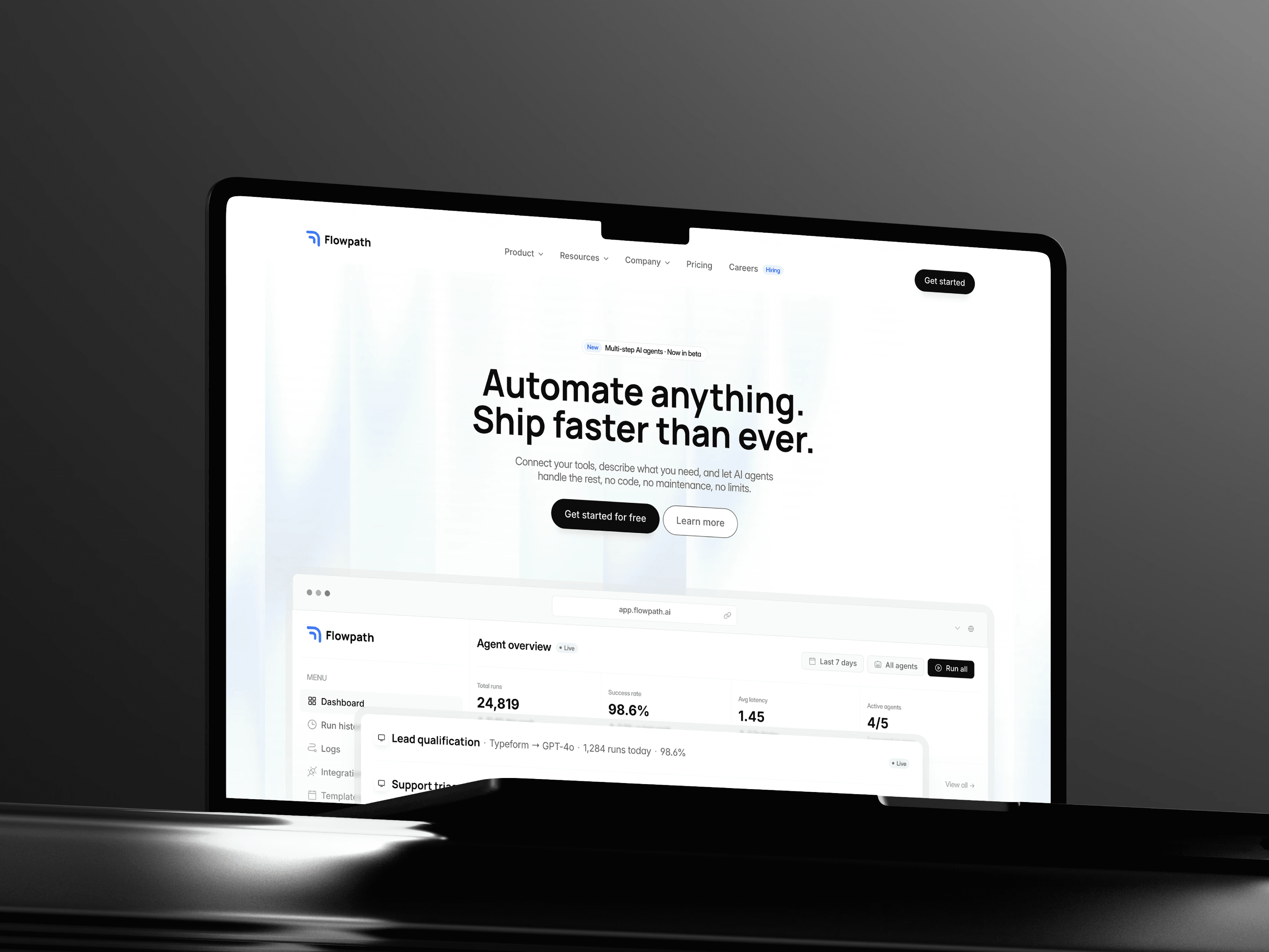
CMS grid of CMS Cards with Show All. Desktop / Desktop - All / Mobile variants.
Media & decoration
Profile Photo

Hero portrait with 3D tilt.
Memoji & Clients
Default


80+ Happy Clients
Avatar with colored background. Properties: Background, Person, Image.
Services-Graphic
Default

Floating 3D shape. Properties: Image, Rotation.
Cursors
4 of 21
Custom cursor states assigned to links and cards. 21 variants.
Hero Ticker
Default
Oversized scrolling name behind the hero. Property: Title.
Section patterns
How pages are assembled. Every page uses the Main layout template; sections follow one scroll pattern.
Top Nav · fixed
Page content (placeholder)
Footer Section · 100vh
Get Template · fixed
Page shell · Main template
Top Nav is fixed and set per page (Home or Back variant, Back label and link). Page content fills the placeholder. Footer Section and Get Template are shared.
Scroll anchor · 1152 · nav target
Content · sticky · 192 top / bottom · gap 96
Section Heading · Center
Body: cards, grid or CMS list
Scroll section
Used for About, Testimonials, Stack, Services, Pricing and Projects. An absolute scroll anchor drives nav highlighting; sticky Content holds a Section Heading and the body.
Title · Heading 1
Photos · 3-up
Meta + CTA | Rich text
Section Heading · Other Projects
CMS Card grid · 2 cols
CMS detail page
Project and Legal detail pages. Main template with the Back nav. A title, then a two-column block: meta and CTA buttons on the left, rich text on the right. Projects end with an Other Projects grid.
" height="25.00139023844741px" id="jBymG44fK" transform="translate(7.499 7.499)" width="25.001390238447406px"/></svg>)